
Introduction
Modern app development thrives on collaboration. Whether it’s brainstorming, code review, or designing user interfaces, teams today work together more seamlessly than ever through real-time, contextual feedback.
With AI now powering much of these collaborative apps, there’s a new concept trending: “Vibe Coding”.
If you hang around devs on X (formerly Twitter), you’ve probably noticed people vibe coding their way to building everything from quick demo apps to production-ready SaaS.
In this tutorial, I’ll show you how to do just that using Cursor AI.
We’ll build a Figma-style commenting system inside a web app with the help of Velt, a toolkit that makes embedding live collaboration features simple.
By the end, you’ll have a fully functional real-time commenting system with nested threads and contextual feedback, just like in Figma.
Key Features We’ll Add to Our App:

- Contextual Comments: Attach comments to elements or portions in your project for users.
- Real-time Collaboration: Sync comment updates across users so you are on the same page.
- Threaded Comments: Allow users to respond to comments and allow threads to clear from your comments section for organization.
Once you complete this tutorial, you will have the fundamentals to build interactive and collaborative features inside your app and you can extend your app with more features and take that experience to the next level!
Collaboration is more than a feature these days. it’s an expectation in the modern digital landscape. Remember the last time you used Figma or Google Docs? How was it so fluid?
It was definitely not just the fact that you were able to comment live and edit in real-time but the closeness and connectivity that felt as if other people were contributing even through a digital interface.
Vibe Coding and Cursor IDE

With AI now powering much of this collaborative apps, there’s a new concept trending: “Vibe Coding.” Coined by OpenAI co-founder Andrej Karpathy, vibe coding is all about letting AI and large language models (LLMs) automate significant portions of your coding tasks.
This frees developers to focus on refining and guiding AI-generated code instead of writing every line manually. As Karpathy puts it:
“There’s a new kind of coding I call ‘vibe coding,’ where you fully give in to the vibes, embrace exponentials, and forget that the code even exists.”
Cursor is one of the most popular AI-powered code editors that makes vibe coding easier, offering smart code completion and conversational coding features like AI Chats, Agents and Composer.
Together, they help developers ship products faster while reducing repetitive tasks. Whether you’re building quick demos or full-scale apps, vibe coding with Cursor AI can supercharge your workflow.
Pros and Cons of Vibe Coding
While vibe coding presents exciting opportunities for accelerating development and broadening participation, it's essential to balance AI assistance with human oversight to maintain code quality and developer proficiency.
Pros:
- Vibe coding helps automate repetitive tasks, allowing developers to build and ship faster by focusing on problem-solving and creative tasks.
- With AI tools handling much of the boilerplate, developers can quickly prototype ideas and iterate on products, speeding up the innovation cycle
- Vibe coding lowers the barrier for entry by letting non-technical users or junior developers create functional applications through natural language instructions.
Cons:
- AI-generated code can sometimes lack optimization or introduce hidden inefficiencies, requiring extra attention from developers to review and refactor.
- Without careful oversight, AI tools may generate code with security flaws or poor handling of user data, increasing the risk of vulnerabilities.
- Over-reliance on AI for coding can lead to reduced hands-on experience with core programming concepts, potentially weakening long-term developer expertise.
Heavy reliance on vibe coding can introduce potential security issues in apps, as seen in this Tweet:

Challenges of Building Figma-Style Comments from Scratch
At first! Building a Figma-style comment system seems simple just for the user to be able to comment and for it to show the comments. The complexity, however, runs high as soon as you enter the backend requirements as many developers will soon find out. Inside this article, we’ll dissect what are the top challenges and efforts required to create from the scratch to support such a system.
Frontend & Backend Requirements
Your frontend will focus on building the user interface for adding and displaying comments. This includes ensuring comments appear in the right place (without flooding unrelated areas) and handling real-time updates smoothly.
While the frontend is crucial for user experience, the real complexity lives behind the scenes, handled by the backend.
The backend is where most of the magic happens. It powers the real-time collaboration, manages data flow and secures your app.
Here are some key considerations for the backend:
Data Storage & Management
Efficiently Storing Comments is important. You will need a database schema that enables threaded discussions (the replies go beneath their parent discussion, not linearly at the end), context ( which element is this comment for? ), metadata e.g. every time you post a comment give me some indication what was commented and by whom.
Scaling this out to millions of comments while still needing to support fast query performance is a massive challenge.
// An example: Database schema for comments
{
    id: 'comment-123',
    userId: 'user-456',
    elementId: 'element-789',
    text: 'This needs revision.',
    timestamp: '2023-10-01T12:34:56Z',
    replies:
    [
            { userId: 'user-789', text: 'Agreed.', timestamp: '2023-10-01T12:35:10Z' }
    ]
}
The real challenges are:
- Designing a schema that scales with the number of comments and users.
- Efficiently querying comments for specific elements or threads.
- Handling updates and deletions without breaking data integrity.
Real-Time Communication
The backend system should be fast enough to sync with users in real-time (responding to sync comments).
You have WebSocket connections, you have a presence for users and the below-mentioned latencies. Especially when dealing with unreliable connection or high user concurrency.
// Backend WebSocket implementation
const WebSocket = require('ws');
const wss = new WebSocket.Server({ port: 8080 });

wss.on('connection', (ws) => {
    ws.on('message', (message) => {
        const comment = JSON.parse(message);
        broadcastComment(comment); // Send to all connected clients
    });

    ws.on('close', () => {
        handleUserDisconnect(ws.userId); // Handle user disconnections
    });
});
Key Challenges:
- Storing the WebSocket connections among multiple server instances.
- Unstable connections (e.g., users on unstable internet or that lose connection momentarily).
- Real-time syncing of comments and not bursting the server.
Security & Compliance
It is one of the highest importance that only authenticated users can see or comment on the app. You will have to set up security, authorize and handle data privacy. And when it comes to multi-region deployments or standards like GDPR, that all becomes incredibly complicated.
// An example Authenticating WebSocket connections
wss.on('connection', (ws, req) => {
    const token = req.headers['authorization'];
    if (!validateToken(token)) {
        ws.close(); // Reject unauthorized connections
    }
});
Key Challenges:
- Implementing secure authentication and authorization mechanisms.
- Ensuring data privacy and compliance with regulations.
- Protecting against malicious attacks (e.g., spam comments or data breaches).
Scalability & Multi-Region Support
Scaling your commenting system is a need of the hour, as your user base grows. This usually includes the setup of servers in different regions and state reconciliation complexity to ensure comments are in sync globally.
// Multi-region presence sync
function syncPresenceAcrossRegions(userId, status) {
    const regions = ['us-east', 'eu-west', 'ap-south'];
    regions.forEach(region => {
        if (region !== currentRegion) {
            notifyRegion(region, userId, status); // Sync user state across regions
        }
    });
}
Key Challenges:
- Handling high-user concurrency without performance degradation.
- Syncing user states and comments across multiple regions with minimal latency.
- Managing infrastructure costs as your user base grows.
Resource Investment
Development Time
It can take weeks or months to build, say a commenting system from the ground up with production-ready codebase. This includes design, development, testing and iterations that you will need to improve over time.
Maintenance
Once it is deployed, you will have to keep working on bug fixes, scale the app and do security updates. How do you handle a rapid influx of users or what is the course of action when you fail to establish a WebSocket connection?
// Handling WebSocket reconnections
socket.onclose = () => {
    setTimeout(() => {
        connectWebSocket(); // Reconnect after a delay
    }, 5000);
};
Costs
Real-time collaboration requires infrastructure to back it. You need servers for WebSocket connections, you need databases for comments and monitoring to make sure that everything is okay.
Introducing Velt SDK

Building real-time collaborative features—such as live comments, cursor trails, or user presence indicators—can often be complex and time-consuming when done from scratch.
Velt SDK simplifies this process by offering a high-performance, plug-and-play solution for real-time presence and collaboration. You don’t have to worry about WebSocket management, session handling or real-time sync challenges.
With Velt, you can focus on your product’s core functionality while seamlessly adding features like Figma-style live commenting. Plus, Velt takes care of the frontend, backend and you can even plug with your own authentication provider so you can ship faster with fewer headaches.
Project Setup
First, create a new React project by running the following command in your terminal:
npx create-react-app figma-style-comment
cd figma-style-comment
Your brand-new React project is now set up! Before we dive in, we need to install one more package. Once that’s done, we’ll be all set to use Cursor AI to generate our app.
Next, let’s install the Velt npm package:
npm install @veltdev/react
This is the bare minimum setup we need for now.
Next, we’ll use Cursor AI to help us build our application. But before that, we need to set up the Velt configuration to integrate it properly.
Configuration
Head over to the Velt Console and get your Velt API key. This will be used to authenticate your requests to the Velt API.
Then store this API key in your .env file:
REACT_APP_VELT_API_KEY=your_api_key
So far we have set up our project with React and we have installed our @veltdev/react npm package, and we have also taken the Velt API key.
Building the Landing Page with Cursor
We now have a basic React project setup. We've also installed the Velt npm package, but before diving into that, our priority is to build the landing page.
So, let’s focus on building the landing page using Cursor first!
We have given a prompt to the Cursor AI chat:
Generate a high-quality, premium-looking landing page for an AI product using React and normal CSS (no Tailwind or styled-components). The landing page should have a modern and sleek design with an engaging hero section, a compelling call-to-action (CTA), and sections for features, testimonials, and pricing.

The design should feel futuristic, elegant, and visually appealing with a clean UI, smooth animations (CSS-based where possible), and a dark theme with neon or gradient accents. Include:

- Hero Section: Large, eye-catching headline, subtext, and a 'Get Started' button.
- Features Section: Three to four cards highlighting AI product capabilities with icons.
- Testimonials: A section with user reviews and profile pictures.
- Pricing: Simple pricing plans with CTA buttons.
- Footer: Contact info, social links, and company details.

Ensure the page is fully responsive and looks premium on all devices. Use CSS for styling, avoiding frameworks like Tailwind or Bootstrap. Maintain proper spacing, typography, and hover effects for a smooth UI experience.

Cursor generated the content for the root component, which in this case is App.jsx. Make sure to review it and confirm that everything is correctly set up before proceeding!

Now, here’s our App.jsx code:
import React from 'react';
import Hero from './components/Hero';
import Features from './components/Features';
import Testimonials from './components/Testimonials';
import Pricing from './components/Pricing';
import Footer from './components/Footer';
import './App.css';

function App() {
  return (
    <div className="app">
      <nav className="navbar">
        <div className="logo">AI<span>Product</span></div>
        <div className="nav-links">
          <a href="#features">Features</a>
          <a href="#testimonials">Testimonials</a>
          <a href="#pricing">Pricing</a>
          <button className="cta-button">Get Started</button>
        </div>
      </nav>
      <Hero />
      <Features />
      <Testimonials />
      <Pricing />
      <Footer />
    </div>
  );
}

export default App;
Also, we need to add the App.css file to ensure our styles are properly applied. Make sure to include it in your project!
:root {
  --primary: #2a2a2a;
  --secondary: #0c0c0c;
  --accent: #00f7ff;
  --gradient-1: linear-gradient(45deg, #00f7ff, #00ff88);
  --gradient-2: linear-gradient(45deg, #ff00ea, #00f7ff);
  --text: #ffffff;
  --text-secondary: #a0a0a0;
}

* {
  margin: 0;
  padding: 0;
  box-sizing: border-box;
}

body {
  font-family: 'Inter', sans-serif;
  background-color: var(--secondary);
  color: var(--text);
  line-height: 1.6;
}

.app {
  overflow-x: hidden;
}

.navbar {
  position: fixed;
  top: 0;
  left: 0;
  right: 0;
  display: flex;
  justify-content: space-between;
  align-items: center;
  padding: 1.5rem 4rem;
  background: rgba(12, 12, 12, 0.8);
  backdrop-filter: blur(10px);
  z-index: 1000;
}

.logo {
  font-size: 1.5rem;
  font-weight: 700;
  background: var(--gradient-1);
  -webkit-background-clip: text;
  -webkit-text-fill-color: transparent;
}

.nav-links {
  display: flex;
  gap: 2rem;
  align-items: center;
}

.nav-links a {
  color: var(--text);
  text-decoration: none;
  transition: color 0.3s ease;
}

.nav-links a:hover {
  color: var(--accent);
}

.cta-button {
  background: var(--gradient-1);
  border: none;
  padding: 0.8rem 1.5rem;
  border-radius: 25px;
  color: var(--secondary);
  font-weight: 600;
  cursor: pointer;
  transition: transform 0.3s ease;
}

.cta-button:hover {
  transform: translateY(-2px);
}

@media (max-width: 768px) {
  .navbar {
    padding: 1rem 2rem;
  }

  .nav-links {
    display: none;
  }
}
Here’s another cool feature in Cursor that I really love!
For example, we don’t have a Hero component yet, and we also don’t have a components directory. But in Cursor, there’s an "Apply" button at the top right corner. When you click on it, it asks where you want to create the file.
All you have to do is select the location and apply the content it takes care of everything! Pretty amazing, right? That’s exactly what I’m doing here. 😃

So let's grasp the Hero Component:
import React from "react";
import "./Hero.css";

const Hero = () => {
  return (
    <section className="hero">
      <div className="hero-content">
        <h1>
          Transform Your Workflow with
          <span className="gradient-text"> AI</span>
        </h1>
        <p>
          Harness the power of artificial intelligence to streamline your
          processes and boost productivity like never before.
        </p>
        <button className="cta-button hero-cta">
          Get Started Free
          <span className="arrow">→</span>
        </button>
      </div>
      <div className="hero-image">
        <div className="gradient-sphere"></div>
      </div>
    </section>
  );
};

export default Hero;
Here is the CSS for the Hero Component:
.hero {
  min-height: 100vh;
  display: flex;
  align-items: center;
  justify-content: space-between;
  padding: 0 4rem;
  position: relative;
  overflow: hidden;
}

.hero-content {
  max-width: 600px;
  animation: fadeIn 1s ease-out;
}

.hero h1 {
  font-size: 4rem;
  line-height: 1.2;
  margin-bottom: 1.5rem;
}

.gradient-text {
  background: var(--gradient-2);
  -webkit-background-clip: text;
  -webkit-text-fill-color: transparent;
}

.hero p {
  font-size: 1.2rem;
  color: var(--text-secondary);
  margin-bottom: 2rem;
}

.hero-cta {
  font-size: 1.1rem;
  padding: 1rem 2rem;
}

.arrow {
  margin-left: 0.5rem;
  transition: transform 0.3s ease;
}

.hero-cta:hover .arrow {
  transform: translateX(5px);
}

.hero-image {
  position: relative;
  width: 500px;
  height: 500px;
}

.gradient-sphere {
  position: absolute;
  width: 100%;
  height: 100%;
  background: var(--gradient-1);
  border-radius: 50%;
  filter: blur(60px);
  opacity: 0.6;
  animation: float 6s ease-in-out infinite;
}

@keyframes fadeIn {
  from {
    opacity: 0;
    transform: translateY(20px);
  }
  to {
    opacity: 1;
    transform: translateY(0);
  }
}

@keyframes float {
  0%,
  100% {
    transform: translateY(0);
  }
  50% {
    transform: translateY(-20px);
  }
}

@media (max-width: 768px) {
  .hero {
    flex-direction: column;
    padding: 6rem 2rem 2rem;
    text-align: center;
  }

  .hero h1 {
    font-size: 2.5rem;
  }

  .hero-image {
    width: 300px;
    height: 300px;
    margin-top: 2rem;
  }
}
Let’s grab the Features component as well, it follows the same pattern as the other components.
One important thing to note: Cursor might ask whether you want to create all components or just a few sample ones. So far, it has generated up to the Features component and then asked for confirmation.

After specifying that we need all the components, Cursor has now created the Testimonial, Pricing and Footer components.
Just double-check that everything is in place, and once confirmed, ask Cursor to proceed to the next step.

As you can see, just grab the code and make sure all the component files are properly added to your project. Double-check that you’ve copied everything correctly. Once that’s done, we’re all set to start our application!
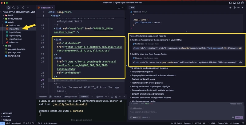
One important thing Cursor asked us to include two specific links in our project. Make sure to add them to the index.html file inside the public directory.
Now we’re all set! Open the landing page we created using Cursor AI.
Simply head over to your terminal and run:
npm start
Your app should be up and running, let’s see it in action!

Now, our entire landing page is ready! It looks stunning with its gradient design and dark mode colors. The icons and overall layout give it a professional touch, don’t you think?
We’ve made incredible progress in building our app, and there’s still more exciting stuff ahead!
Integrating Velt SDK
So far, we’ve successfully completed our landing page now, let’s take our app to the next level!
First things first, we need to wrap our App component with VeltProvider and pass in the API key. This will ensure that Velt's features are available throughout our app. Let’s get started!
import {
  VeltComments,
  VeltCommentsSidebar,
  VeltProvider,
} from "@veltdev/react";
import React from "react";
import ReactDOM from "react-dom/client";
import App from "./App";
import "./index.css";

const root = ReactDOM.createRoot(document.getElementById("root"));

console.log({ API: process.env.REACT_APP_VELT_API_KEY });

root.render(
  <VeltProvider apiKey={process.env.REACT_APP_VELT_API_KEY}>
    <VeltComments darkMode={true} />
    <VeltCommentsSidebar darkMode={true} />
    <App />
  </VeltProvider>
);
I've added two more components from Velt:
VeltCommentsVeltCommentsSidebar
We'll be using both of these components, just go ahead and add them for now. VeltComments is essential since it's the core feature we're focusing on, while VeltCommentsSidebar will come into play a bit later. I'll show you exactly where we’ll need it soon!
Authenticating Users
An important thing to note you don’t need to worry about handling user authentication yourself. Velt takes care of that for you!
All you need to do is send the necessary user information from the frontend and Velt will handle the authentication process seamlessly. That’s it you’re good to go!
Here’s our AuthComponent, where Velt’s useIdentify hook helps us identify users effortlessly.
//Warning: Make sure this is a child component to VeltProvider
//and not within the same file where VeltProvider is placed.

// 1) Import the useIdentify hook
import { useIdentify } from "@veltdev/react";

export default function YourAuthComponent() {
  const userService = () => {
    return {
      uid: "888",
      organizationId: "organizationId123", // this is the organization id the user belongs to. You should always use this.
      displayName: "Syket",
      email: "[email protected]",
      photoURL: "https://i.pravatar.cc/300",
      color: "#ee00ff", // Use valid Hex code value. Used in the background color of the user's avatar.
      textColor: "#ee00ff", // Use valid Hex code value. Used in the text color of the user's intial when photoUrl is not present.
    };
  };

  let yourAuthenticatedUser = userService();

  // 2) Fetch the relevant User info from yourAuthenticatedUser
  const { uid, displayName, email, photoURL, organizationId } =
    yourAuthenticatedUser;

  // Create the Velt user object
  const user = {
    userId: uid,
    organizationId: organizationId, // this is the organization id the user belongs to. You should always use this.
    name: displayName,
    email: email,
    photoUrl: photoURL,
    color: "#ee00ff", // Use valid Hex code value. Used in the background color of the user's avatar.
    textColor: "#ee00ff", // Use valid Hex code value. Used in the text color of the user's intial when photoUrl is not present.
  };

  //3) Pass the user object to the SDK
  useIdentify(user);

  return <div></div>;
}
Add this component to your components directory and name it AuthComponent. The code is quite self-explanatory just need to specify the user's information so that Velt can store it on their server.
Next, we’ll create our document component, which utilizes the useSetDocument hook to initialize a new document. This hook requires two arguments:
- Document ID – A unique identifier for the document.
- Document Name – The display name of the document.
We also define the position of the document toolbar on our website. Here, we’ve set it to appear at the bottom center of the page I’ll show you how it looks in just a bit! 😊
👉 Instead of "document," you can use any name here it's just an identifier for tracking and collaboration. Choose a name that makes sense for your use case!
Additionally, we’ve used three powerful Velt components that make our implementation effortless:
- VeltCommentTool – This enables adding comments to the document.
- VeltPresence – Shows who is currently viewing the document.
- VeltSidebarButton – Displays all comments and threads in a sidebar.
These components take our app to the next level not just for viewing comments but unlocking many more interactive features!
// 1) Create a component that will represent your document

//Warning: Make sure this is a child component to VeltProvider
//and not within the same file where VeltProvider is placed.

// 2) Import the useSetDocument hook
import {
  useSetDocument,
  VeltCommentTool,
  VeltPresence,
  VeltSidebarButton,
} from "@veltdev/react";

export default function YourDocument() {
  // 3) Set a document ID
  useSetDocument("unique-document-id", { documentName: "Document Name" });

  return (
    <div
      style={{
        position: "fixed",
        bottom: "20px",
        left: "50%",
        transform: "translateX(-50%)",
        backgroundColor: "#0F0F0F",
        border: "1px solid #2F2F2F",
        padding: "12px 24px",
        borderRadius: "50px",
        boxShadow: "0 4px 12px rgba(0, 0, 0, 0.1)",
        display: "flex",
        alignItems: "center",
        gap: "16px",
        zIndex: 1000,
      }}
    >
      <VeltCommentTool darkMode={true} />
      <VeltPresence />
      <VeltSidebarButton darkMode={true} />
    </div>
  );
}
Next, we need to create one more component that will import both the document and authentication components. This new component will then be used inside our App component, which serves as the root of our application.
import YourAuthComponent from "./YourAuthComponent";
import YourDocument from "./YourDocument";

const VeltToolbar = () => {
  return (
    <div>
      <YourDocument />
      <YourAuthComponent />
    </div>
  );
};
export default VeltToolbar;
We're almost ready to go! Just make sure to add the VeltToolbar component inside your App.jsx. Head over to your App component, integrate it properly, and don’t forget to restart your app to see the changes in action.

Boom! 🎉 You’ve successfully integrated the Velt SDK into your app!
Here, you can see the toolbar we mentioned earlier, positioned at the bottom center of the screen. This toolbar introduces three key options:
- Comment Icon – This allows you to add comments directly to the document.
- User Icon – Indicates your logged-in status.
- Sidebar Icon – Displays all comments and threads you’ve created on this document.
Now, let’s go ahead and test this feature! 😃
Our app now features a Figma-style commenting system! Not only can we add comments, but we can also start threads, upload images, and even send audio and video recordings, unlocking tons of possibilities.
Let’s try adding an image, edit and react to a comment and see how it looks! 😊
We can select specific areas to add comments. As shown in the image above, we can also attach images along with our comments. Now, let's take a look at how these comments appear in the sidebar.

All comments are conveniently displayed in the sidebar. When you hover over an image, a popup appears, showing the full comment thread for that specific image.

We've integrated a Figma-inspired commenting feature on our site with the help of Cursor, and it is live! And of course, all comments are stored on the Velt server securely. We do not have to do any authentication, comment-storing or fancy backend logic Velt handles all that for us out of the box.
Checkout live app in action - here
Additional Velt Features
Beyond presence and real-time cursors, Velt offers several powerful collaboration features:
- Live Reactions - Add floating emojis and reactions that appear in real-time
- Follow Mode - Let users follow each other's movements and actions. Perfect for presentations and guided tutorials
- Huddles - Create instant audio/video meeting spaces within your app. Seamless integration with your existing UI
- Live Selection - Select and highlight text in real-time. Perfect for collaborative editing
- Video Player Sync - Sync video players across users. Perfect for video conferencing and presentations
Check out more features from here
Conclusion:
In this Velt Figma-Style Comment Feature integration tutorial, we explored how to seamlessly incorporate this component into your app. You now have a solid foundation from getting started with Velt and handling user authentication to displaying comments using VeltCommentTool.
We also utilized the useSetDocument hook to define the document context and useIdentify to manage user authentication and authorization.
By blending Cursor AI with the concept of Vibe Coding, we were able to fast-track the development of this feature. AI handled much of the repetitive coding, while we focused on shaping and refining the implementation. This approach shows how modern developers can prototype faster, work smarter, and ship products quicker by combining AI-powered workflows with robust tools like the Velt SDK.
You can further enhance the authentication feature by displaying comments made by a specific user or showing the total comment count anywhere in your app giving you full flexibility to customize the experience.
With this guide, you’ve now got the foundation for building a fully interactive, Figma-style commenting system—proving how "vibe coding" with AI tools like Cursor AI can simplify even complex, real-time collaborative features.

Top comments (11)
this is super cool!
Great Article. Is this an alternative to Liveblocks?
Yes. Velt provides a component first approach to adding collaboration features. We have extensive set of pre-built capabilities for each feature. eg: velt.dev/comments
Oh okay, cool. Lemme play with it
Awesome, Let us know what you're building with it
Sure
Interesting Project, This looks quite similar to Liveblocks. I will explore velt to find more about it
Great let us know what you think!
Oh Haven't heard about Velt. this looks interesting. Thanks for sharing Arindam
I was trying to build something similar, Thanks for sharing. I'll try this
Fantastic project!